Insights The psychology of colour: How important are your brand colours?

Guy Nicholson
Creative Lead
Colour plays a huge role in influencing how we interact and react to most things in our life - whether that’s nature, the weather, food, clothes, or the decor in our homes. So it’s no surprise that colour is a vital factor for customers when interacting with a brand. They can convey an emotion or engage a person much faster than words.
The relationship between a brand and its colour palette is an essential part of any branding toolkit. The logo of any brand is its primary asset, as it provides the visual representation of the company and hopefully its core values to the customer. One of the most important components I consider when designing a logo is its primary colour(s) and supporting colour palette. Its colour has a significant effect on the psychological perception of the viewer.
A study called The Impact of Colour on Marketing found viewers make a subconscious judgement about a brand product within the first 90 seconds of seeing it. 85% of these people cited colour as their main reason to buy a product, and 80% believed colour increased recognition of the brand.
How different colours affect emotions and colour theory is a whole insight piece in its own right, although here’s a few nuggets to explain:
Yellow: Optimism - think the warmth of the sun
Green: Peaceful - think of the calming effects of nature
Red: Now this could mean Excitement or Danger - just think of fire!
Colour psychology is a key factor in branding and marketing products and services:
- In marketing, it is a tool that can define a strategy and ultimately a product's success
- Using the right colours helps your brand standout in the competitor landscape, allows marketing collateral to grab attention and encourages further review by the viewer
- It contributes to a brand’s reputation. As its following grows, customers associate the logo and colours with the product or service
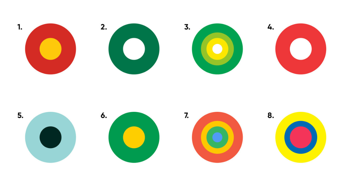
Pop quiz
Can you recognise these brands from their colour palette alone?
*answers at the bottom
Brands are often recognised by name, logo or product, but the first thing the viewer usually recognises is the colour. As mentioned earlier, using a brand’s signature colour in its marketing can increase customer recognition by 80%. Even without seeing the Golden Arches, you would know a McDonalds ad anywhere.
Becoming identified by a specific colour represents a huge opportunity for brand recall. Colour has the ability to instantly convey the message and meaning of the brand.
Colour recognition and brand loyalty
The target audience is at the forefront when it comes to colour selection. Some companies fall into the habit of picking colours they prefer but that can contradict the brand values. Always ensure the palette resonates with your audience.
- Research is key. Identify the colours in the competitive landscape and find a colour space that aids standout against competitors while still adhering to the above point. If you're a challenger or disruptor brand choose colours that your customers get excited about.
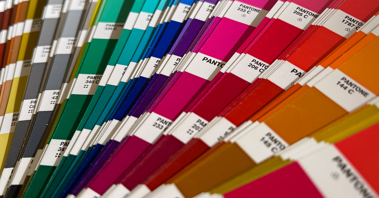
- Be aware of colour trends. The Pantone colour of 2023 may be Viva Magenta, but what looks good today may put off your audience tomorrow. Your palette requires longevity to work alongside your brand.
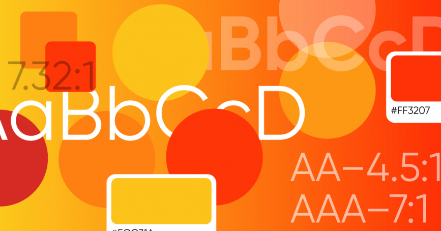
- Colours look different on different platforms. A good design team will make sure your brand’s collateral is adapted to suit. Your colour reference codes will be set in RGB (digital) and CMYK (print), to ensure brand consistency.
- More recently, from 2018 onwards, colour accessibility in the digital space has become more prominent and essential. There are many tools available now to check your colours adhere to the recommended requirements when used online.
Colours in your brand and marketing play a vital role in influencing your target market and how they engage and recognise a company's products and services. It is essential that time is invested in research into your target market and colour psychology to ensure the right palette is chosen to support a brand.
*1. McDonalds 2. Starbucks 3. BP 4. Coca-Cola 5. Tiffany & Co 6. Subway 7. Google 8. Lidl
Share insight
Let's talk
- Call us +44 (0) 1256 334567
If you would like to find out more about how we can help you connect strategically, creatively or digitally, then call us or get in touch. We’d love to hear from you.
Related insights