Insights Are brands losing their personality?

Shannon Valentine
Content Marketing Partner
From Pepsi to Parisian fashion houses, paths that rarely cross are now converging on the road to minimalism.
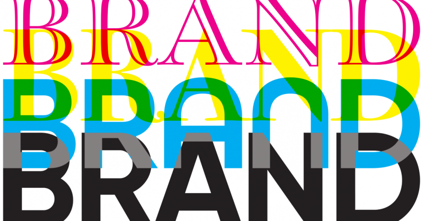
Have you noticed that every brand seems to be stripping down their logo to the bare essentials? From luxury boutiques to tech giants, companies are swapping intricate, character-filled designs for clean, minimalist aesthetics.
Are brands losing their personality, or is there something they’re not telling us?
Holding on to individuality
Since the dawn of time, logos have had plenty of personality to share. Remember the elaborate Burberry knight?
This was all to attract long-lasting attention.
Brand salience was more important than ever, and it’s made some of the most iconic brands of all time still stand tall today, without having to say much at all. However, it seems every industry is making the change towards simplicity, but is it right for the brand?
Strategy-first approach
Jaguar’s new identity feels sleek, but does it still roar?
A brand is more than just a mark. It’s the full experience. From the photography to the colour palette, from the language to the tone of voice. It’s the sum of all these elements that shape perception.
Jaguar’s rebrand, whether you love it or not, is charged with intent. It pulses with energy, aligning with its new strategy. The question isn’t just whether the logo has changed, but whether the entire identity still delivers on the brand’s promise.
Brands aren’t static; they live, breathe, and evolve through perception. The real test isn’t in the logo itself but in how people connect with the full brand experience over time. Because in the end, the true power of a brand isn’t just in its design — it’s in how people feel about it.
The death of detail in the digital age
We’re not here to play the blame game, but it’s something your parents have likely said to you as a teen:
“It must be that damn phone!”
The modern consumer isn’t exactly flipping through a print catalogue these days, they’re scrolling at the speed of light through Instagram, TikTok and pretty much any tiny app icons on their smartphone.
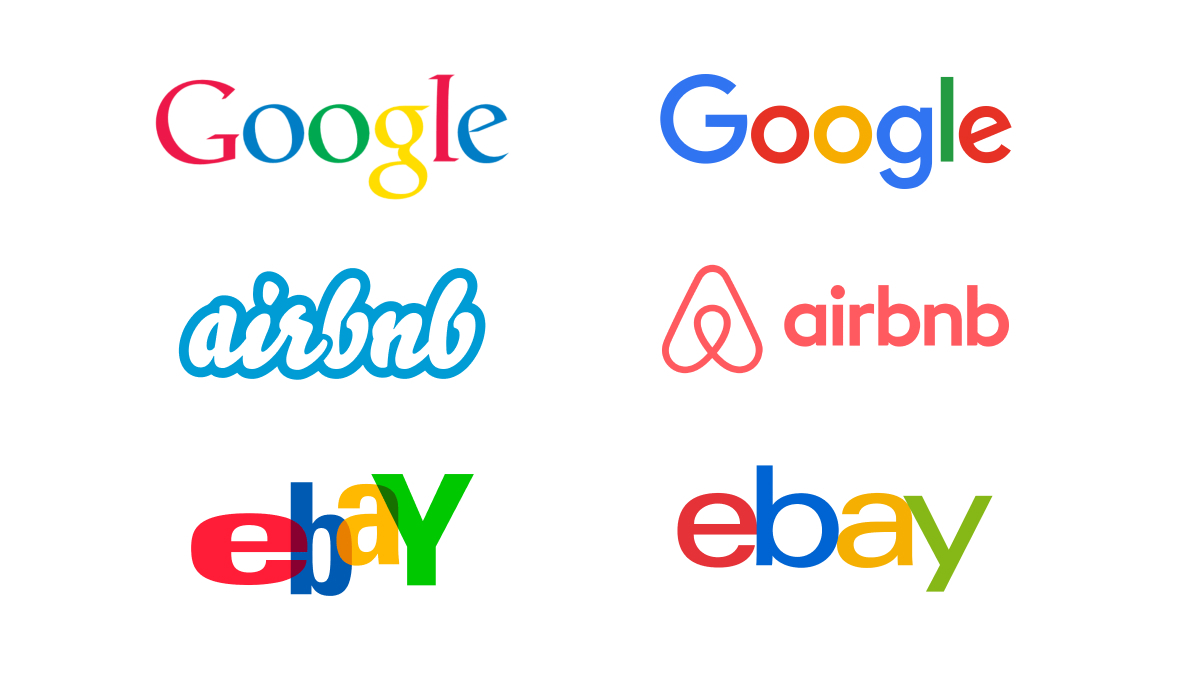
Google, Airbnb, Spotify and eBay have all undergone major logo simplifications to fit these new digital constraints.
Even in the automotive industry, we’ve seen brands like Volkswagen and Nissan flatten their once-dimensional emblems. Maybe the 3D metallic textures that looked amazing on a car grille just don’t have the same effect on a website banner.
Another reason for this shift is digital readability. The internet (mostly mobile browsing) has changed the game. Those detailed, serif-heavy, or calligraphic fonts that once graced storefronts and magazine spreads simply don’t translate well onto tiny phone screens and social media icons.
Logos today need to be instantly legible at any size – whether it’s on a billboard or favicon.
Ornate to ordinary
Luxury brands have always had us in awe over their grandeur and exclusivity, and their well-known logos have always reflected that.
Take Balmain and Yves Saint Laurent for example.
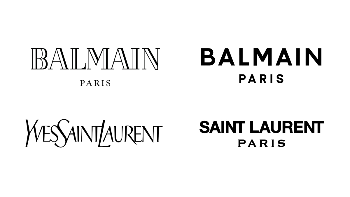
Their past logos had unique typography and artistic elements that screamed sophistication. Now? They’re almost indistinguishable from one another.
While we don’t necessarily know the reasoning behind so many businesses refreshing their brands, simplifying logos often aligns with the industry shift towards accessibility.
Those high fashion brands, once reserved for an elite clientele, now need to appeal to younger, digital expert consumers who engage with brands primarily online.
The power (and problem) of simplicity
Don’t get us wrong, minimalist branding isn’t bad, but it needs to be right for the brand.
It makes logos more versatile, but there is a downside when every brand starts to look the same, as it obviously becomes harder to stand out!
If you lined up the new logos of Balmain, Burberry, and Saint Laurent, could you tell which is which at a glance? The distinct personalities that once set them apart have been flattened – literally and figuratively.
When every brand leans into the same aesthetic, they risk losing their unique identity. A good brand identity starts with not falling into trends or fads that won’t stand the test of time. It’s about creating designs that echo the brand’s personality and principles.
Debranding: a trend or the future?
Welcome to debranding. The process of removing or reshaping a brand’s identity.
Now you know the term, you’ll recognise it everywhere. It’s been particularly popular among brands that already have strong recognition.
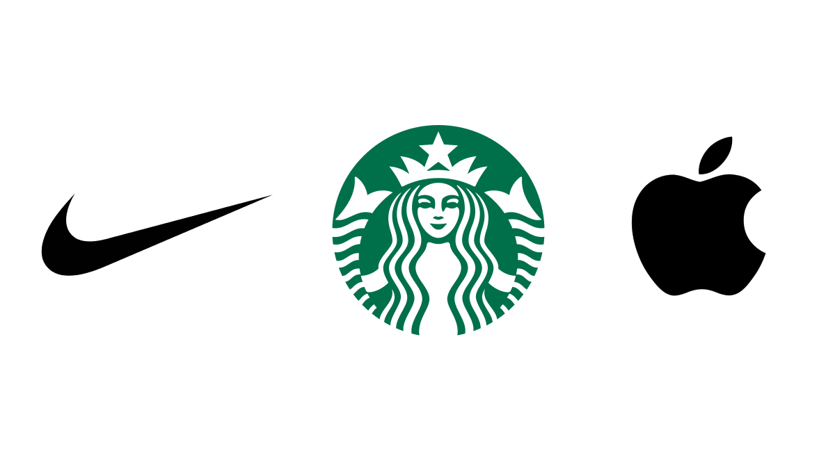
For example, Nike, Apple, and Starbucks have removed their brand names entirely, relying solely on their symbols. Social platforms like Instagram and YouTube have abandoned detailed icons in favour of abstract, more simplified versions.
But a brand is more than just its logo.
Other elements play a huge part in brand recognition, offering total flexibility across all types of collateral, whether it’s digital, print, packaging, or merchandise – ensuring consistency and adaptability in every context.
Fonts
Typography is a silent storyteller. Think of Disney’s whimsical script or Vogue’s elegant serif. It’s all part of the brand experience. Choosing the right font brings instant recognition.
Colours
Some brands even own a colour. Cadbury’s rich purple, Tiffany & Co.’s signature blue, or McDonald’s red and yellow aren’t just design choices, they’ve become emotional triggers that reinforce brand identity over time.
Patterns and textures
Beyond logos and colours, there’s brands that expand their identity to recognisable patterns. For example, you know as soon as you see a beige checker print it’s most likely going to be Burberry.
As brands continue to simplify logos, the key to brand identity is nurturing a memorable presence across all touchpoints. When a brand nails its visual language – logo, fonts, colours, and patterns – it becomes unmistakable.
For those with strong consumer familiarity, this works nicely.
But for newer brands trying to establish themselves, oversimplification could make them forgettable in a crowded marketplace.
When a brand is gradually building recognition and loyalty, a simple logo or design might not provide enough of a visual anchor to leave a lasting impression on consumers.
Have we gone too far?
While minimalism has its perks, there’s a growing concern that branding is becoming too generic. A logo needs to tell a story in order to connect with the right audience.
By prioritising functionality over personality, many brands are losing what made them special in the first place. If this trend continues, will we reach a point where brand differentiation disappears altogether?
Will we look back at these logo redesigns the same way we now cringe at early 2000’s web design? Only time will tell.
All is not lost
As technology evolves, so will branding. With AR, VR, and the metaverse on the rise, we may soon see a renewal of dynamic, interactive logos that respond to digital environments in real time.
One thing is certain, branding will always adapt to consumer behaviour. And while today’s trend is all about simplicity, tomorrow might bring a return to bold, expressive design. As long as it’s in line with a business's values, brands need to strike a balance between simplicity and distinctiveness, or risk blending into the background.
Struggling with your brand identity?
Whether you need a subtle refresh or a full rebrand, working with an agency of branding experts is where the magic happens.
Get in touch with us to learn more about our process and how we can support you.
Share insight
Let's talk
- Call us +44 (0) 1256 334567
If you would like to find out more about how we can help you connect strategically, creatively or digitally, then call us or get in touch. We’d love to hear from you.
Related insights