
Connecting church communities through brand purpose, positioning and identity
The naming strategy was centred around the church’s value proposition – support, companionship, friendship, diversity of experiences…and more.

“The team took great care to listen carefully to what we were saying, helping us to explore our priorities and aims and turn them into creative output which is authentic to the culture and values of our group of churches. I enthusiastically recommend The Escape.”

Ready to grow?
The best brands don’t just get noticed. They get felt. Let’s build yours.
If you’re an ambitious brand that shares our passion for building emotional and meaningful connections with customers and colleagues, let’s talk.
In need of more creativity
-
Growing a brand through entrepreneurship and community
Southampton Science Park


The project
Across the North Hampshire Downs, 12 churches serve a wide and varied community.
Each with its own history, its own congregation, and its own role within the landscape. But together, they shared a common challenge; how to remain relevant, visible, and connected in a changing world.
A community that needed to feel connected again
Over time, engagement had begun to decline, particularly among younger audiences.
The existing identity—both in name and expression—felt distant and difficult to relate to. It didn’t reflect the warmth, support, and shared experience that sat at the heart of the benefice.
The opportunity wasn’t just to modernise, but to reconnect.
Finding a name that invites people in
Through workshops, conversations, and community engagement, a clearer picture began to emerge.
At its core, the church wasn’t just about place or tradition but people, connection, and the idea that there is always something more to discover.
From this, a new name was developed: More to Life.
Simple, open, and inviting curiosity. A name that reflects both faith and community, and the role the church can play in people’s lives. Refined to More, the identity created a clear and accessible foundation for change.
A brand designed to feel human and inclusive
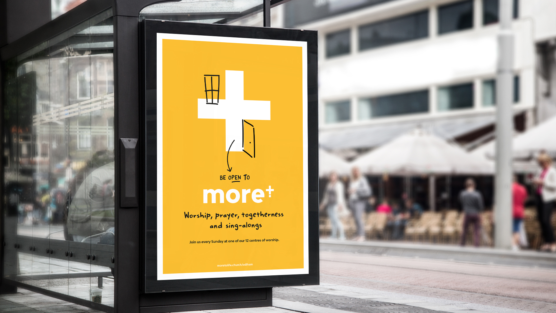
Visually, the identity balances tradition with a more contemporary, approachable tone.
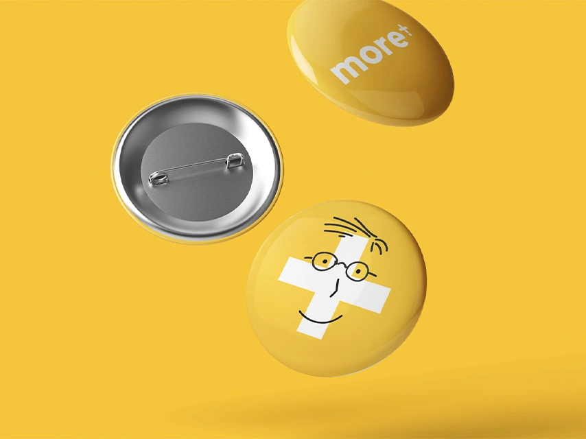
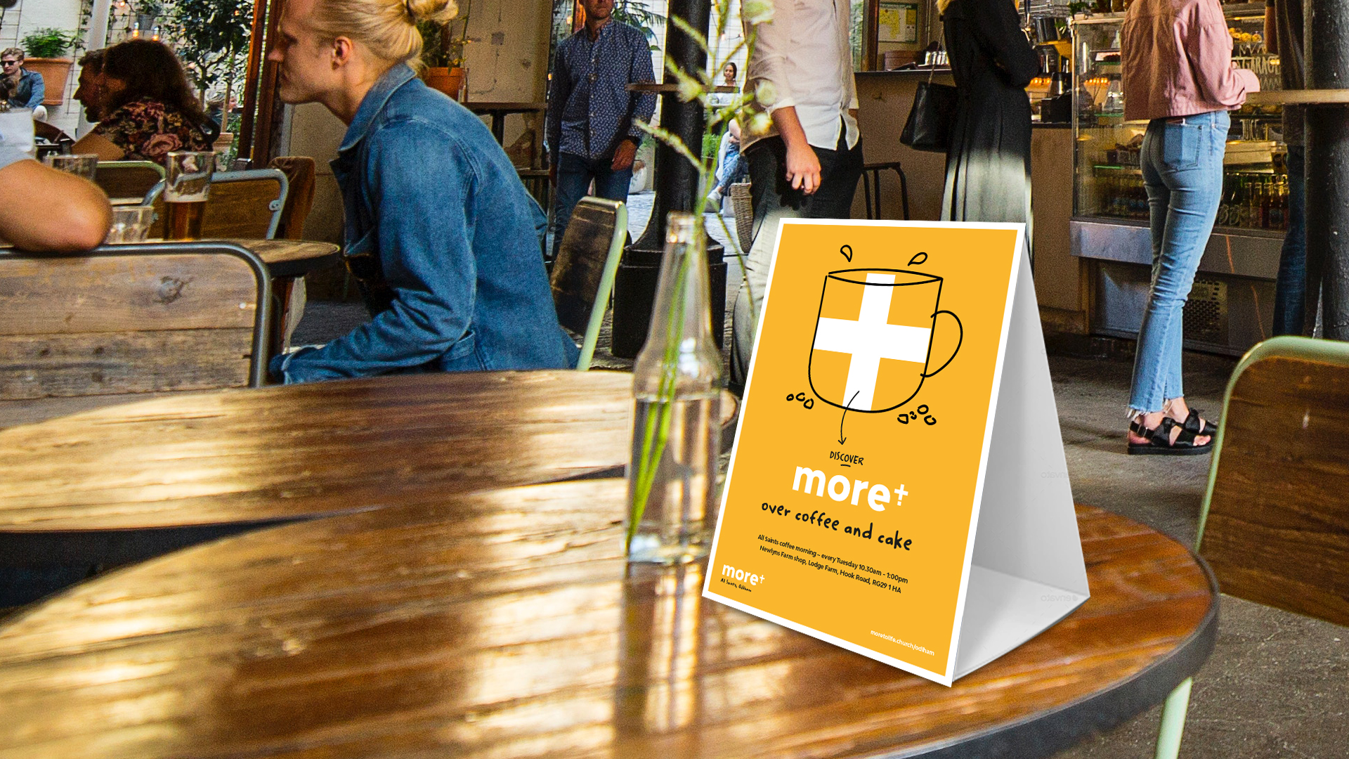
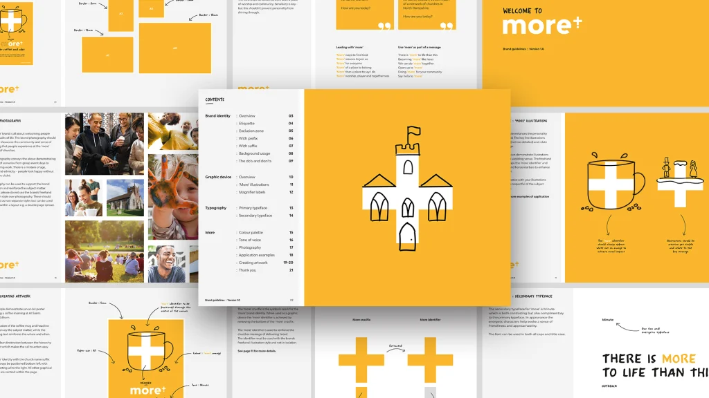
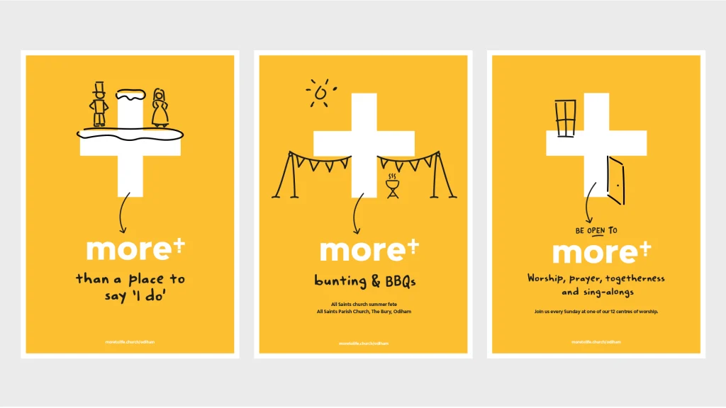
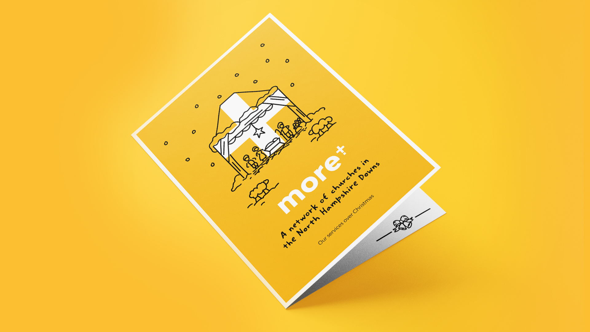
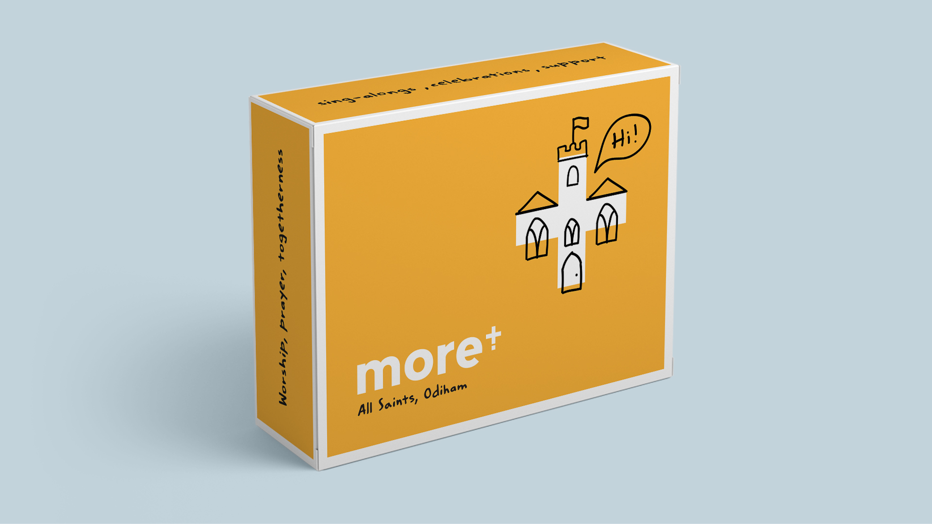
A cross combined with a plus symbol creates a distinctive device that represents both faith and addition, community and connection. Supported by bold colour, hand-drawn illustration, and a softer typographic style, the system introduces warmth and flexibility, allowing it to adapt across audiences, activities, and touchpoints.
The new identity was rolled out across print, events, seasonal communications, and a new website, creating a more consistent and visible presence across the region.
Importantly, it brings together all 12 churches under one shared identity, while still allowing space for individual expression.
A more visible, more connected community
What followed was a shift in how the benefice is experienced.
A clearer, more approachable identity has helped engage a younger audience, while strengthening the sense of connection across the wider parish network.
More has become a confident, recognisable expression of faith. One that reflects the people it serves and the community it continues to build.