Bargate Homes Creating a new homes identity for people who don’t buy new homes
The brief
Think you don't like new homes? Then think again. Bargate Homes is a developer synonymous with its strapline of 'new homes for people who don't buy new homes' and is changing perceptions through impeccable classic quality and outstanding service. The thought and careful planning that goes into every part of their developments is second to none. You only need to look at any of their 1,366 homes to see that.
So when they came to us needing help building an identity, brand and landing page for their latest housing development in North Stoneham Park, Hampshire, we knew exactly what was required.
Services provided
- Brand naming
- Brand identity
- Design & Illustration
- UX & UI Design
- Website & App development
Project team
-
 Guy NicholsonCreative Lead
 -
 John PikeStrategy Director

The challenge
Sensitivity towards the location
It was important to understand the history and the local environment. This was to ensure we could safeguard the integrity of the development, especially when considering the brand name and visual identity.
Create an individual identity
An identity for the development as a whole which showcased its uniqueness and desirability but was also cohesive within the wider Bargate brand.
Name of development and homes
Not only did we need a name for the development that encompassed the history of the land, but also the individual house types.
Create a cohesive visual system
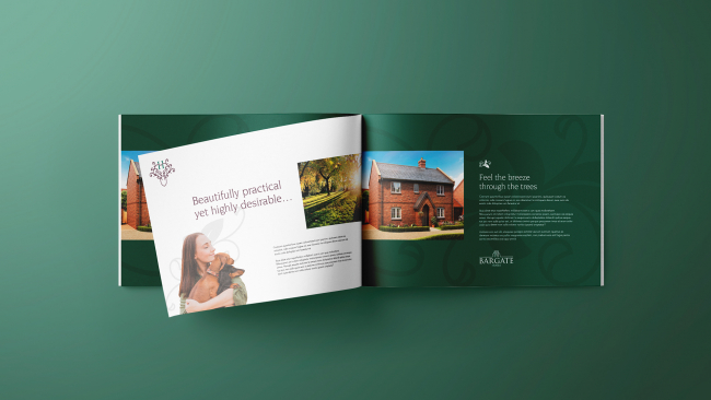
We needed to ensure that the brand could be implemented seamlessly across the physical and digital space, from brochure to website.
The solution
In depth area research
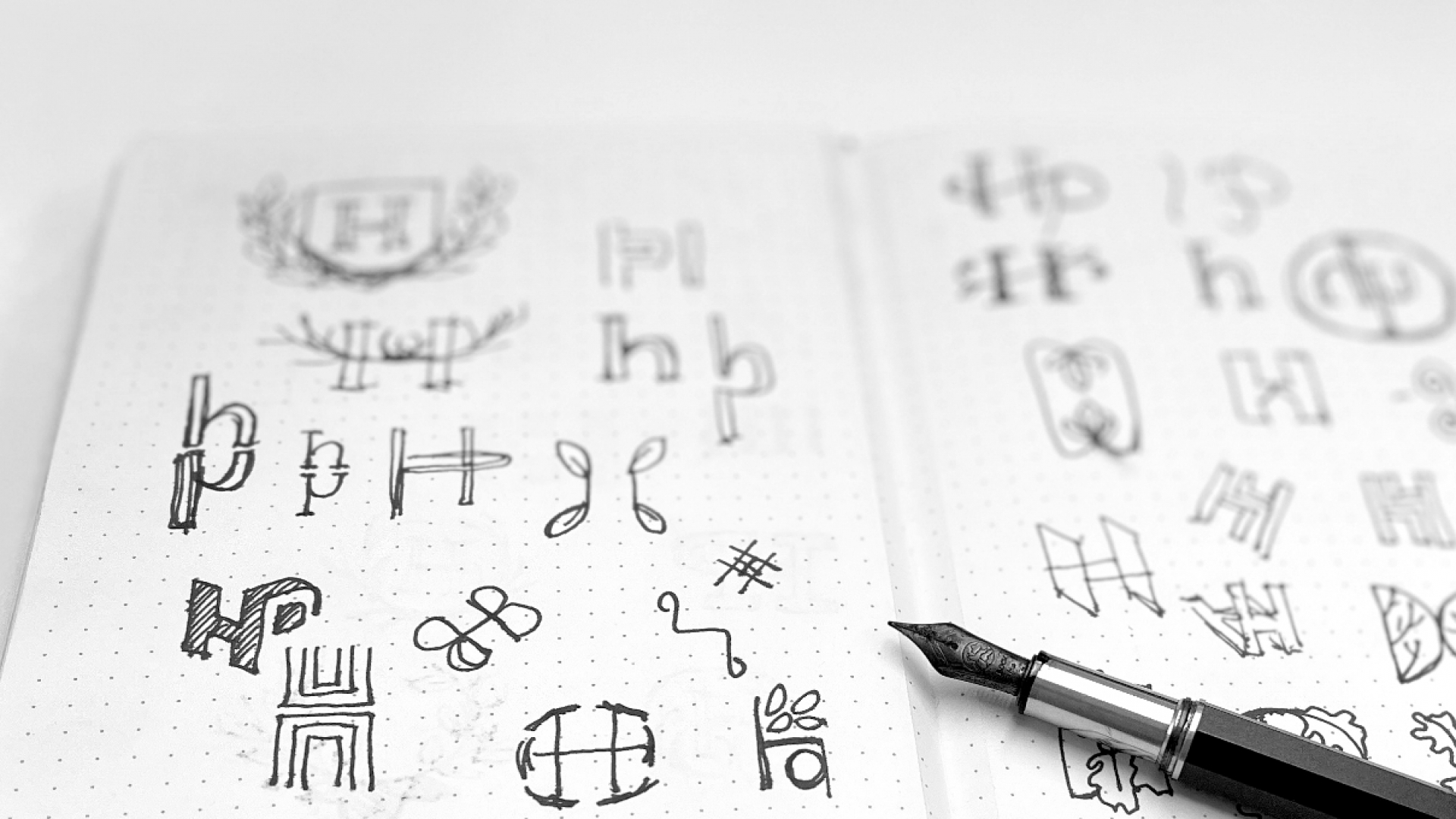
Using real-time, as well as historical, data provided insights into the area helped create the name Heritage Place, along with the naming of all individual housing types.
Make it an experience
From the development's brand and identity to the landing page on the website, we wanted to make it an experience for customers, that was unique to Heritage Place. So a carefully thought out colour palette, visual system and bespoke landing page were non-negotiables.
Seamless typography and accessibility
We needed to be sensitive towards the current Bargate brand and website while giving the development its own personality. New typography, which considered accessibility, helped create a seamless user journey.
Connect emotionally with customers
It was important to connect emotionally with customers. This was achieved through lifestyle imagery, videography, and an engaging visual system which stayed true to the 'heritage' of the development's location.
Final thoughts
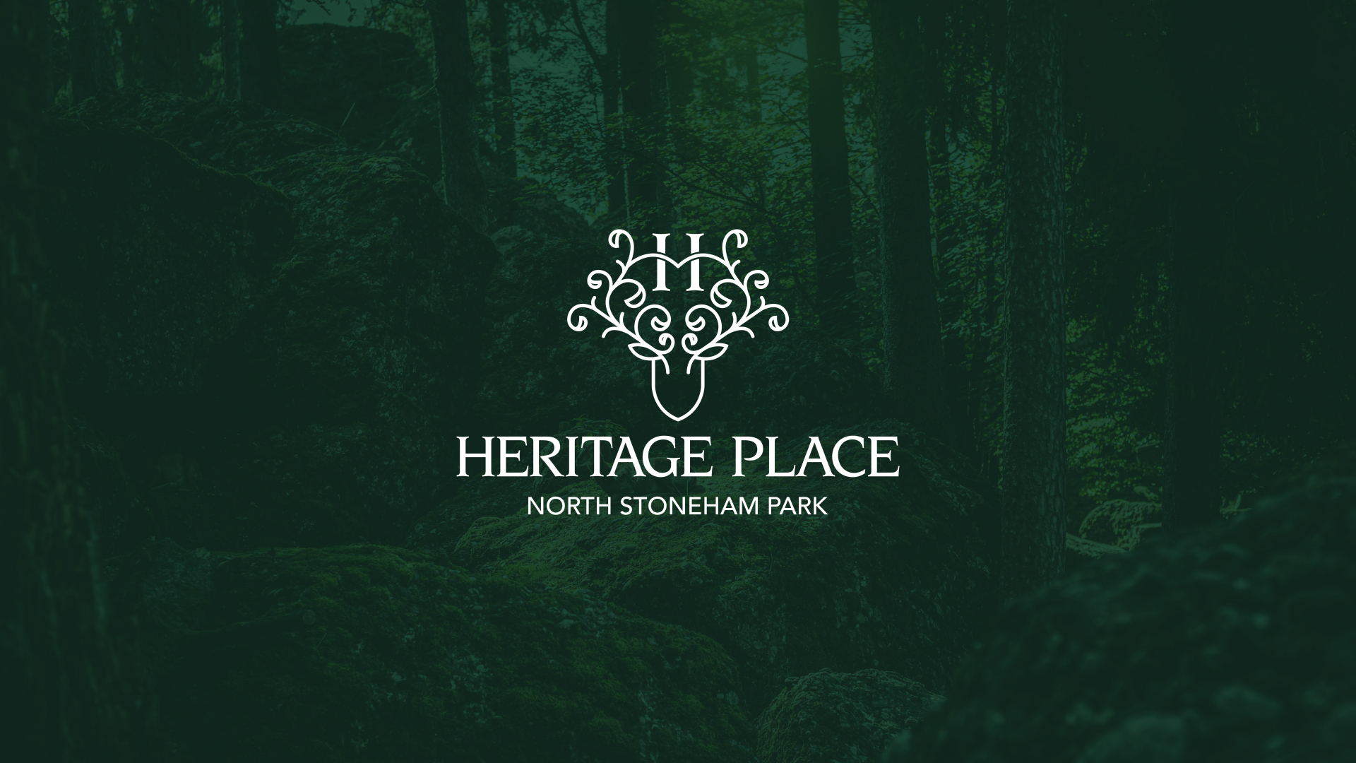
Through thorough research and time to understand the history of the area, we have managed to create a brand and identity for the development that encompasses the heritage of these homes.
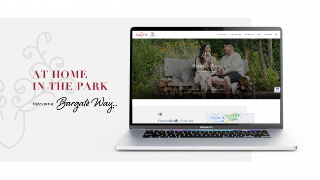
With a fresh new colour palette, visual system and a bespoke landing page, an immersive and emotive experience can be achieved to promote and complement the beautiful and thoughtful development that is Heritage Place.
Share work
Let's talk
- Call us +44 (0) 1256 334567
If you would like to find out more about how we can help you connect strategically, creatively or digitally, then call us or get in touch. We’d love to hear from you.
