KSA Transforming Kenn Scadden Associates into KSA Architects
The brief
Kenn Scadden Associates is one of the South coast’s leading independent architectural practices. KSA moved into new leadership in 2018 with an objective to remain embedded and retained by its core clients but to diversify and modernise for greater appeal to a wider client base and new target sectors. This objective required a reposition of the brand – strategically, verbally and visually – as well as a new website and ongoing marketing plan.
Services provided
- Brand strategy
- Brand naming
- Brand identity
- UX & UI Design
- Website & App development
Project team
-
 Ian MumfordChief Executive Officer
 -
 John PikeStrategy Director
 -
 Tom HopkinsDeveloper

Our approach
Initial conversations with KSA started around the development of a new website, but it quickly became apparent through discovery that a bigger opportunity presented itself to move the business forward.
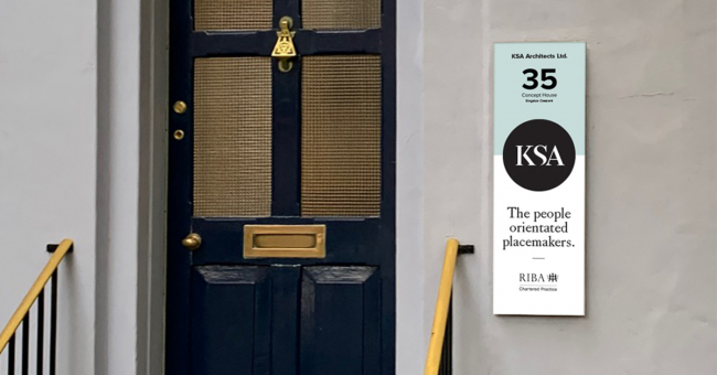
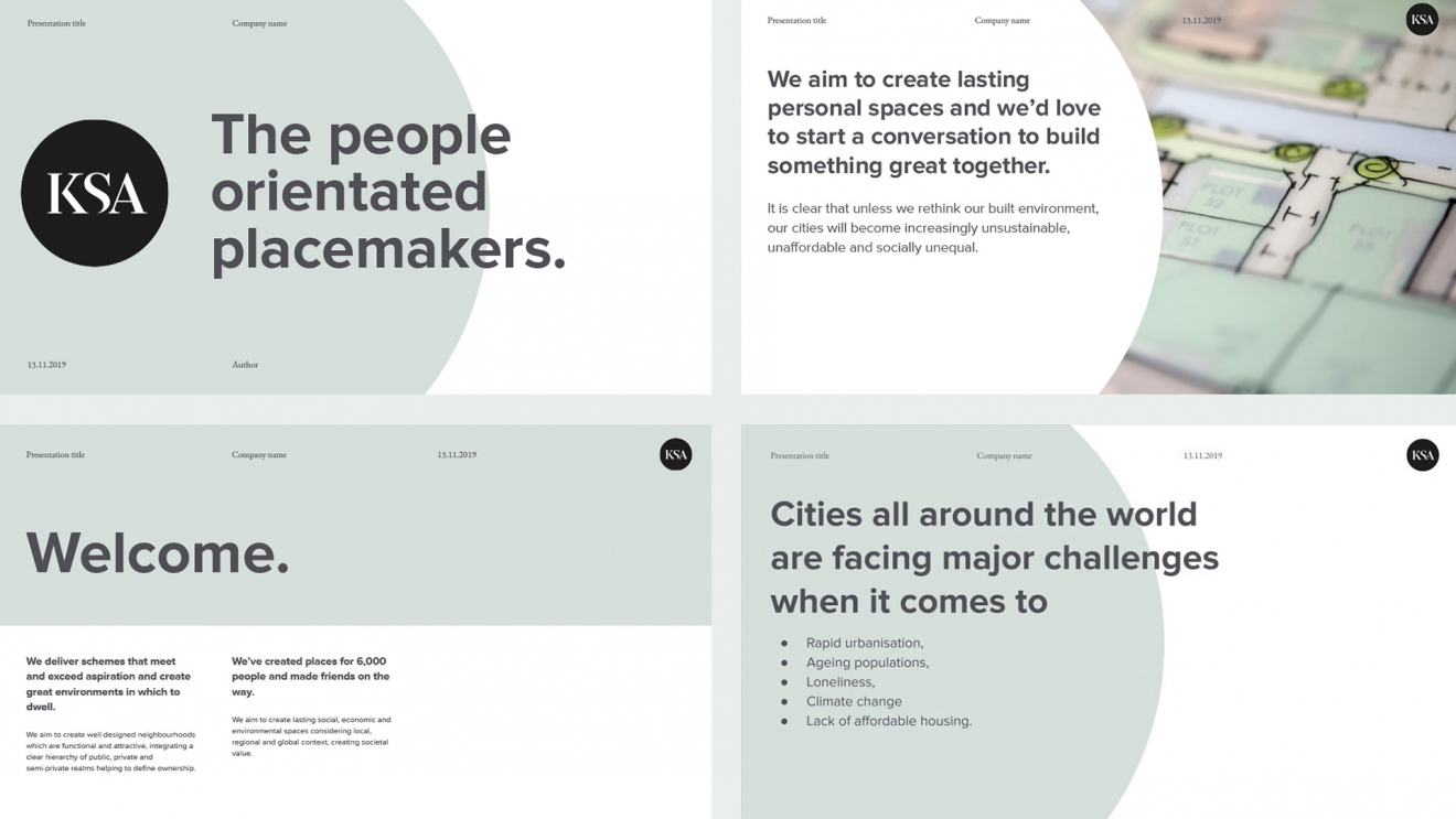
Competitor analysis identified that the architectural market was fairly ‘me too’ and that there was opportunity in the market for differentiation. Our discovery workshops identified a very human core that ran through KSA. They took pride in creating places where people could prosper, so we quickly identified both the point of differentiation and the opportunity for a new position. KSA were definitively ‘the people oriented placemakers’.
The new position also provided an opportunity to take stock of the name of the practice. We undertook an ideation process to research and identify whether the existing name would enable the change in the business, showcase new leadership and challenge in new sectors.
Like what you've seen so far?
Find out how we can help you
We proposed new suggestions and rationalised each but circled back around to KSA, an abbreviated version of the full name, but one that enabled change to happen without losing the history of the brand. By chance, it also still encapsulated the letters of the surnames of the new managing partners – Knight and Slack (Architects).
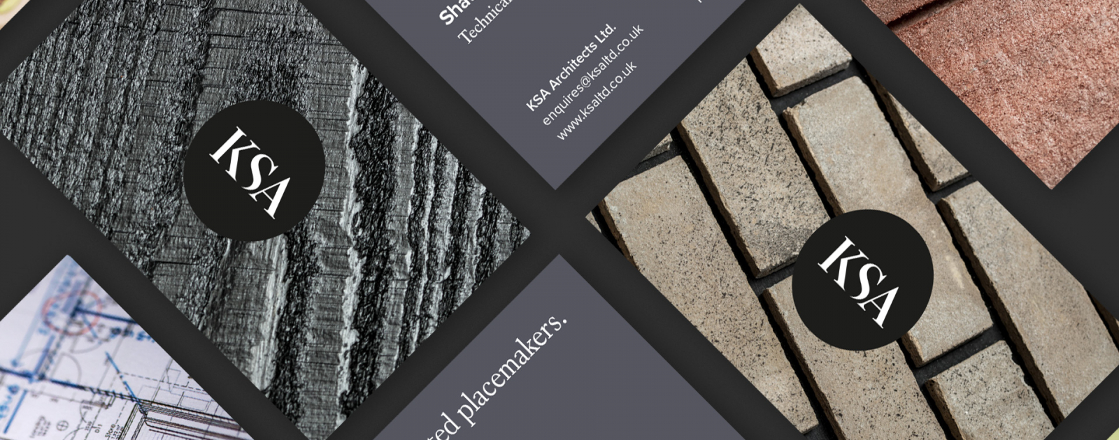
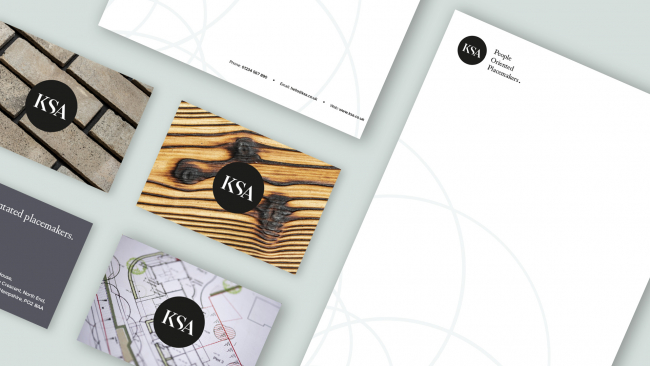
Next, we began the creation of the new visual brand. Our approach was to keep the visual brand simple and clean so the brand narrative and the people-orientated focus of the new brand could shine through. A simple black circle with beautifully crafted, upper-case serif typography gave us the mature and confident mark we required. The symbol was a mark of quality and reassurance, a dot that symbolised ‘people-orientated places’.
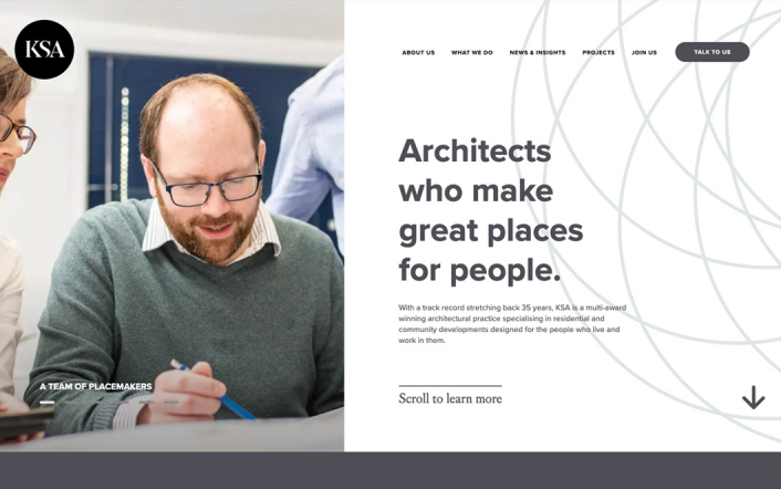
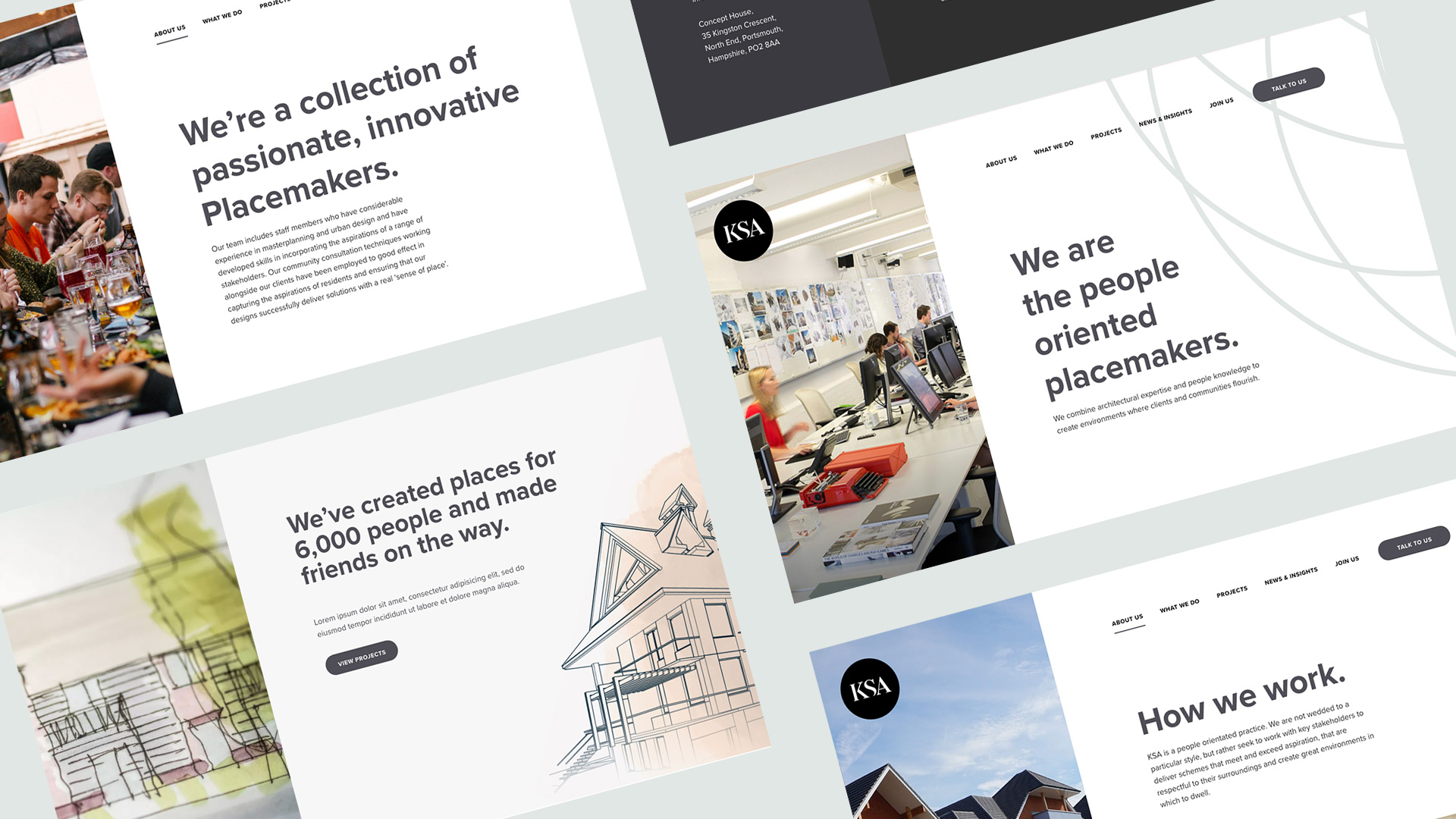
Beyond the brand, we created a full tool kit of business assets, as well as activating the brand across various channels. A key component of launching the new brand was KSA’s online front of house. We designed and developed a new content-managed website, including content creation and photography, with a UX and UI focus on people, underpinned by a strong human, purpose-oriented narrative.
The outcome
KSA is a company that has been brought together not only under new leadership, but by its new brand. Its distinct and purposeful new position and visual and verbal identity are a symbol of a new direction, but which retains the core values and legacy of 30 years of hard work.
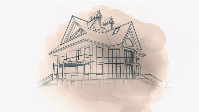
As a practice, KSA goes from strength to strength, winning new contracts with existing clients such as Vivid and McCarthy and Stone, as well as being invited to tender for new opportunities in – as yet – uncharted sectors.

Share work
The results
-
45%
increase in goal completions
-
65%
of traffic coming from organic search
-
13%
increase in new users
Let's talk
- Call us +44 (0) 1256 334567
If you would like to find out more about how we can help you connect strategically, creatively or digitally, then call us or get in touch. We’d love to hear from you.


