
Transforming legacy into a brand that belongs in today’s world
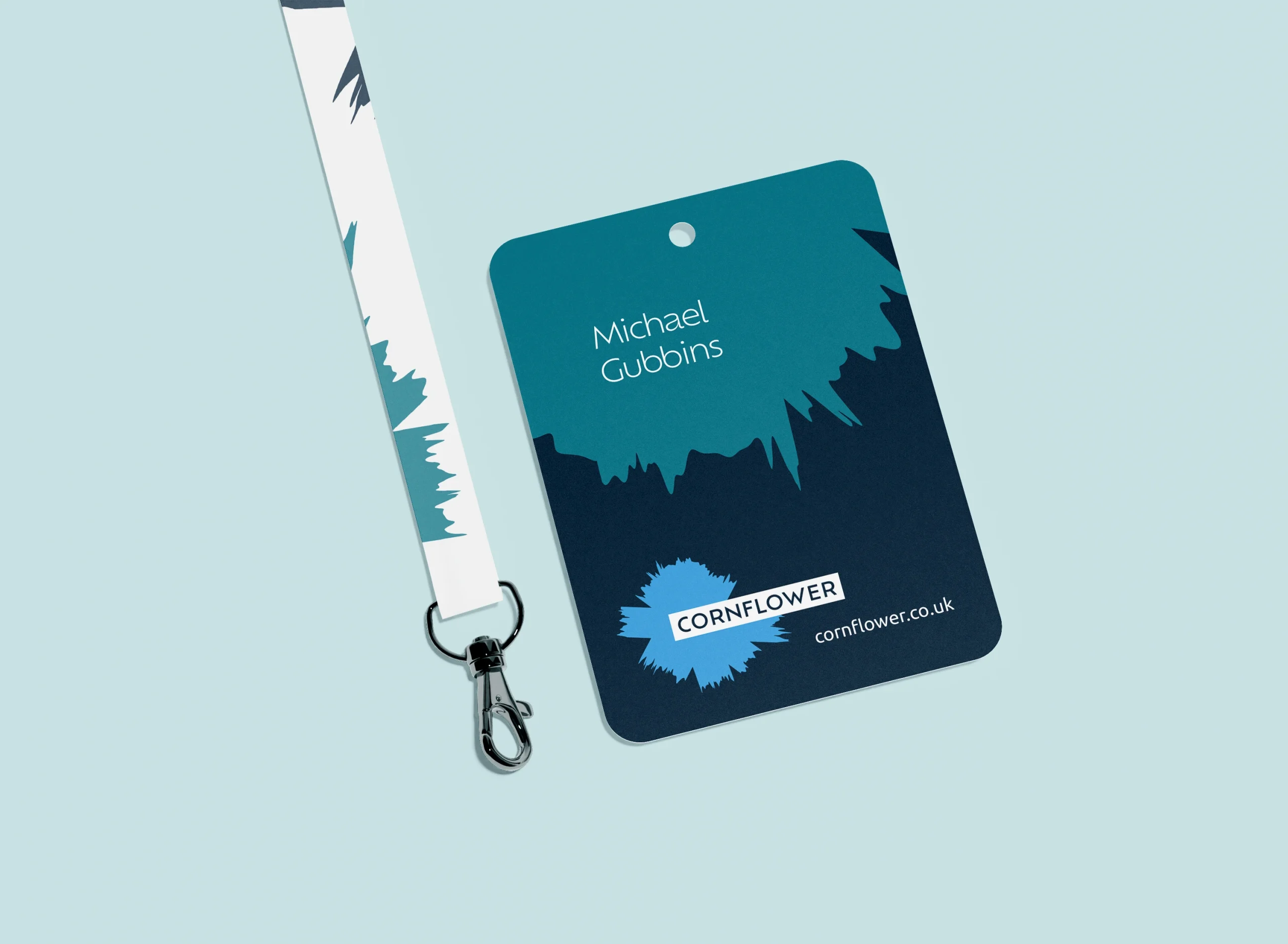
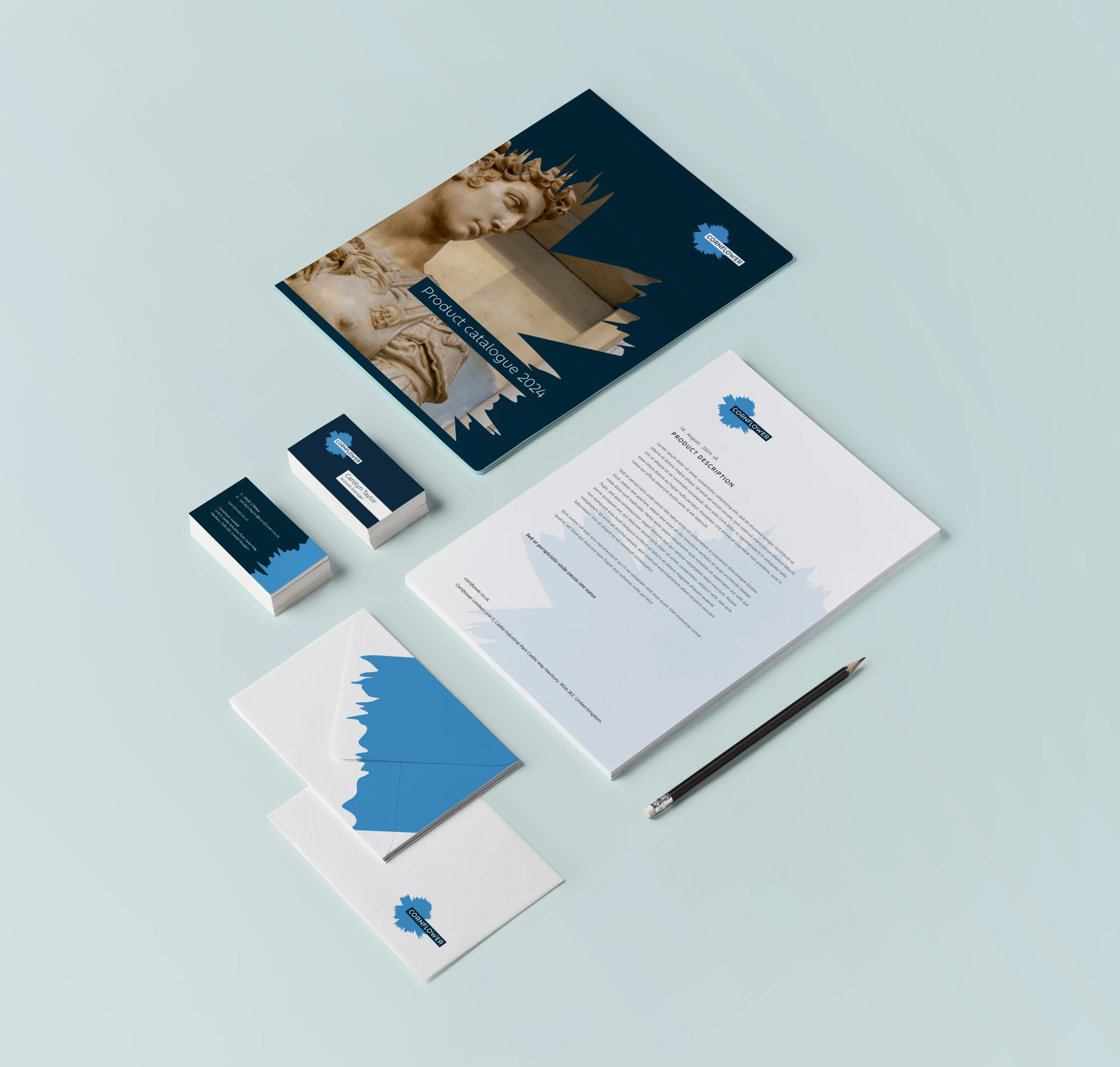
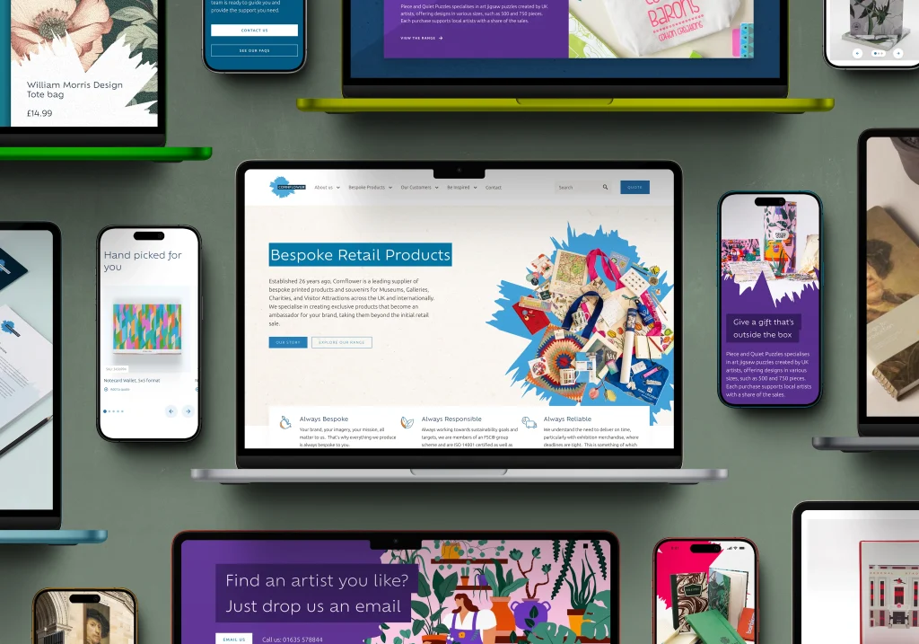
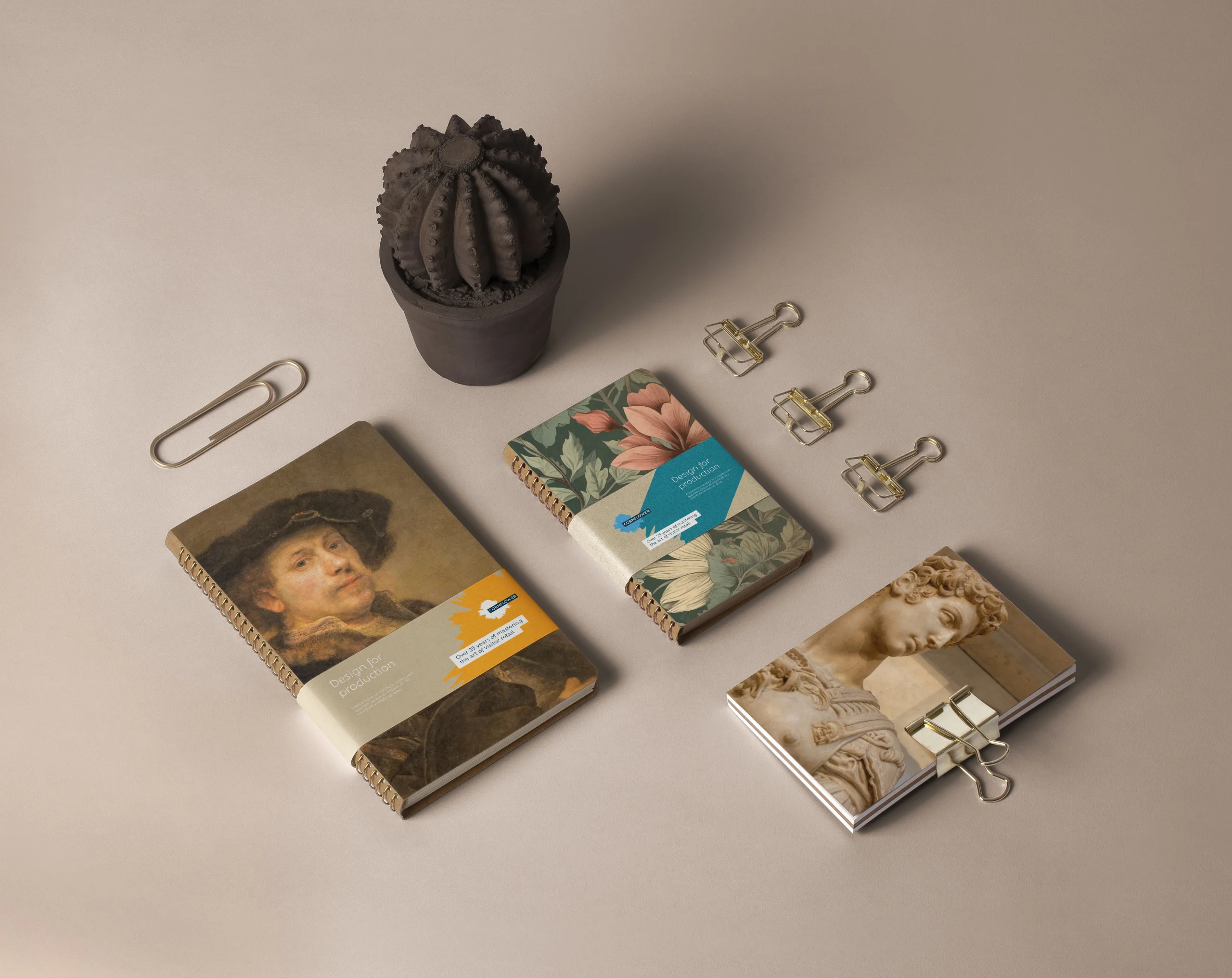
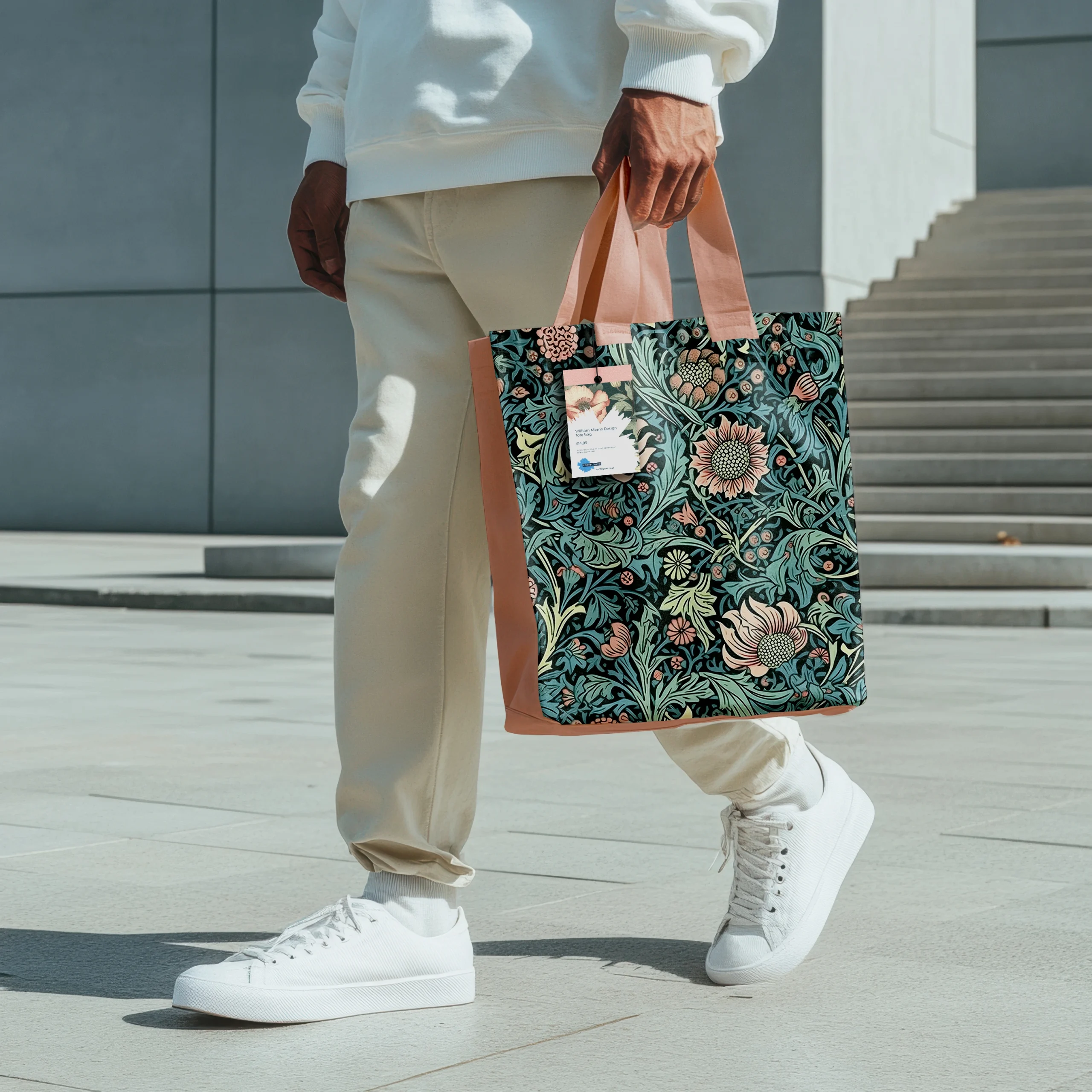
We created a visual identity that embodied the cultural significance of museums and galleries and translated it within the online experience


Ready to grow?
The best brands don’t just get noticed. They get felt. Let’s build yours.
If you’re an ambitious brand that shares our passion for building emotional and meaningful connections with customers and colleagues, let’s talk.
In need of more creativity
-
Growing a brand through entrepreneurship and community
Southampton Science Park


The brief
Cornflower had reached a turning point.
After nearly 30 years, the business had evolved. It had expanded its offer, grown its reach, and built a reputation for creative, bespoke work across visitor attractions. But its identity hadn’t kept pace.
What once reflected heritage now risked holding the brand back from expressing the creativity, scale, and ambition it had grown into.
A legacy ready to evolve
Once we looked closer, the issue wasn’t a lack of identity, it was a lack of alignment.
Cornflower’s work lived in thoughtful, curated spaces—museums, galleries, and cultural destinations—yet its brand didn’t fully reflect that same level of creativity or confidence.
The opportunity was to create an identity that felt at home in those environments, while still honouring the history that had shaped the business.
Reimagining the brand from the ground up
We approached the project as more than a refresh, rethinking how the brand could express both heritage and progression.
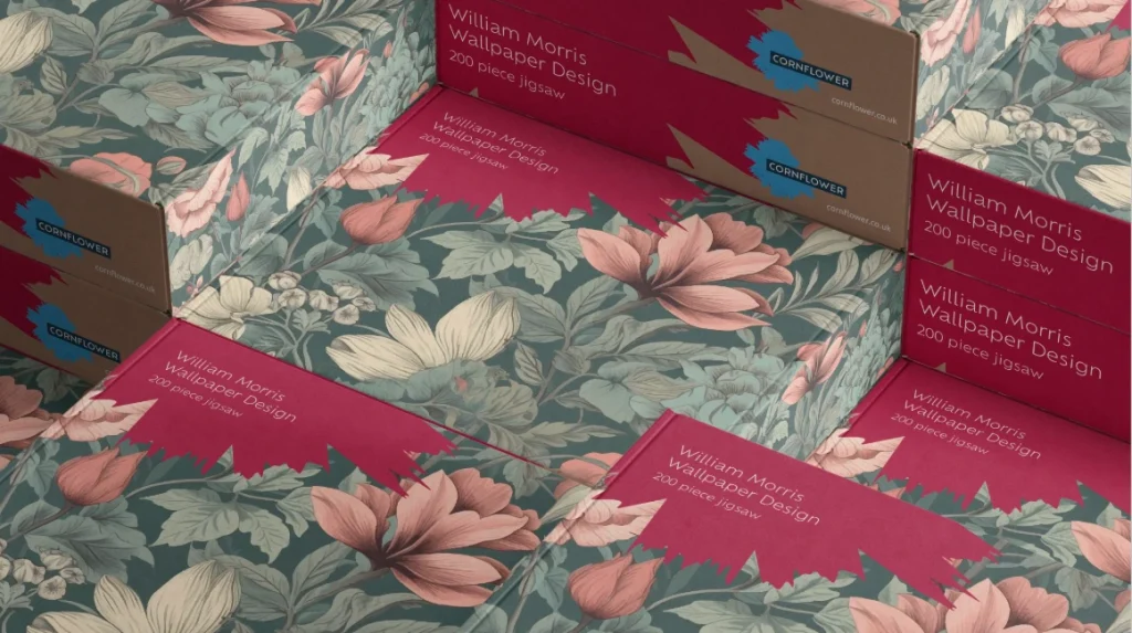
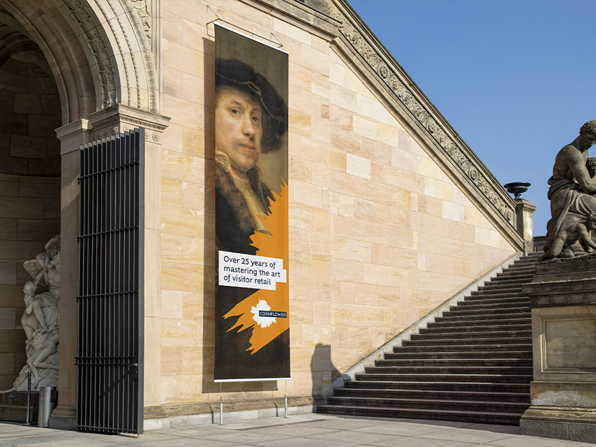
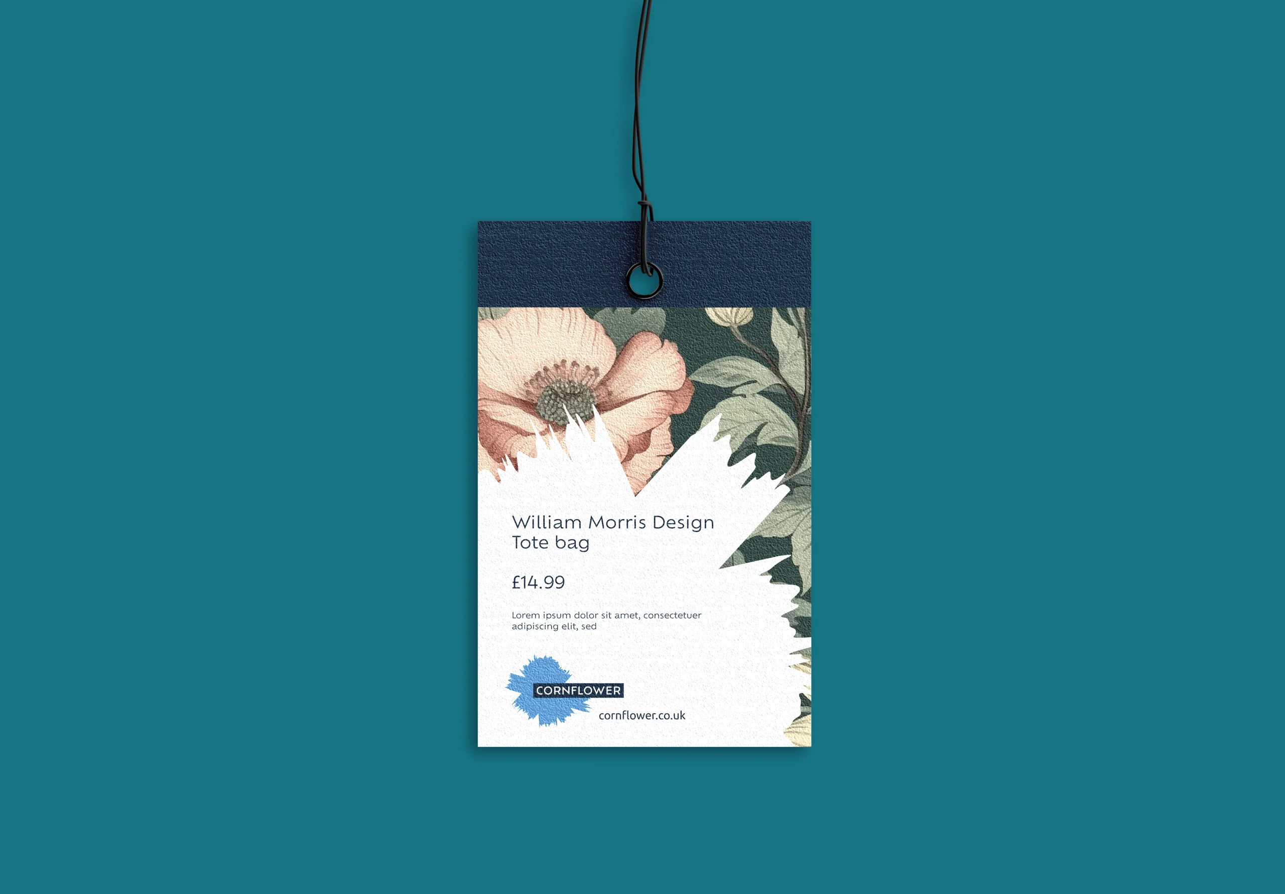
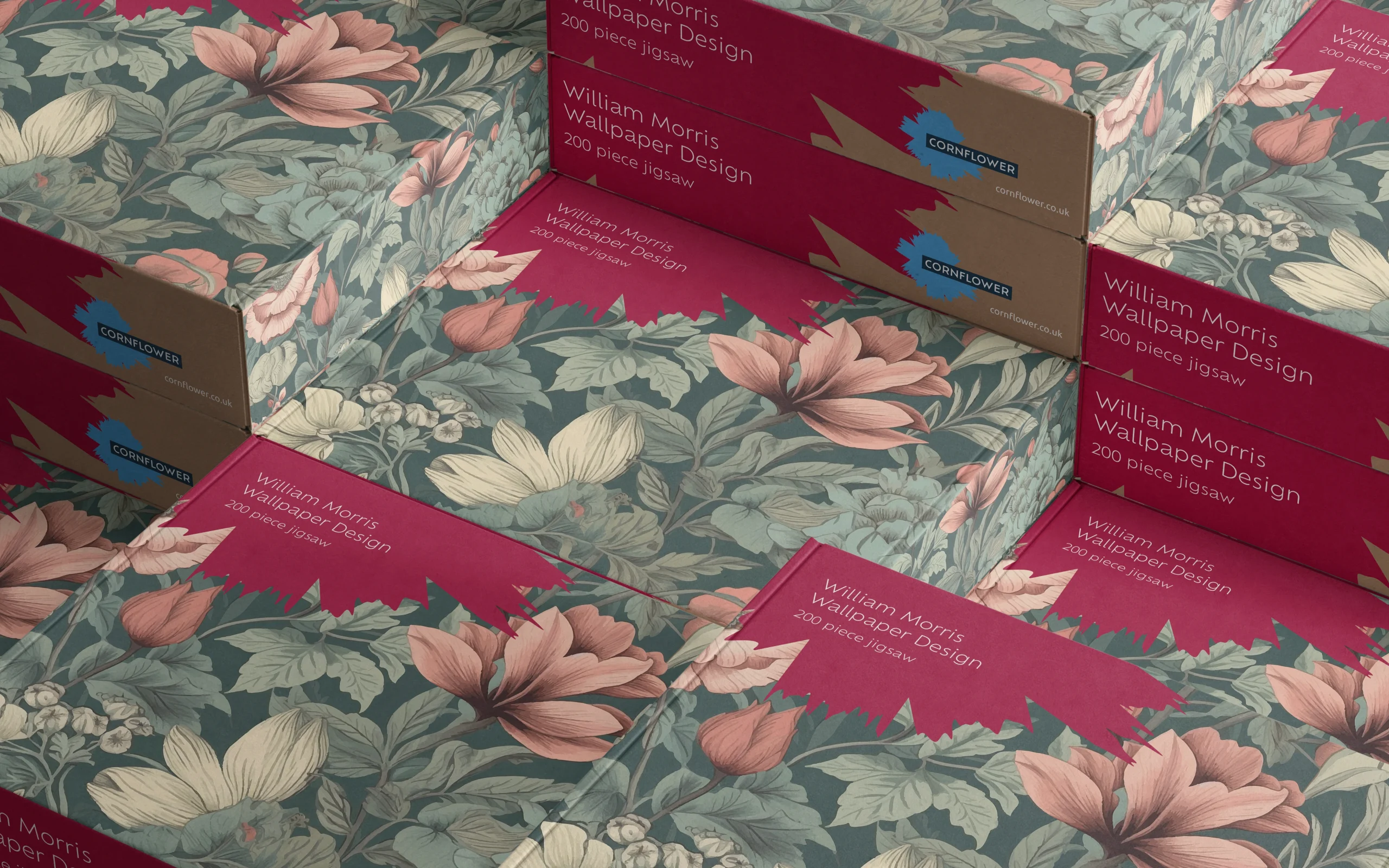
The new visual language draws directly from the cornflower symbol and the expressive nature of Cornflower’s work; introducing brushmarks, curated typography, and a flexible design system that balances craft with contemporary clarity.
The result is an identity that feels tactile, confident, and versatile—equally suited to physical products, retail environments, and digital platforms.
A digital experience to match
To support the repositioned brand, the website was rebuilt from the ground up.
We restructured the user journey to bring greater clarity to the offer, unify multiple sub-brands, and better support a non-transactional sales model.
The new platform creates a more cohesive and intuitive experience—one that reflects the quality and creativity of the work itself.
Since launch, Cornflower has seen a 40.66% increase in average search engine position, alongside a stronger, more consistent presence across its touchpoints.
More importantly, the brand now aligns with the reality of the business. A brand that expresses its creativity, supports its growth, and positions it confidently for the future.